
+44 (0) 845 68 015 68+44 (0) 1332 419 999
Mon-Fri 8.00 - 5.30Sat-Sun Email support


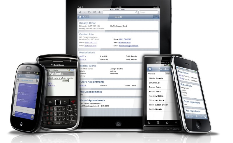
Remember a time when mobile phones were getting smaller, when anything bigger than the size of your wallet was considered a cumbersome “brick”?
Nowadays the ways in which our devices are being is used very different, and as such require more generous screen sizes to display all this extra content and a larger physical dimension to accommodate it. Mobile phones are, in every sense of the word, absolutely massive; not just a means of telecommunication anymore but also a provider of… well, everything.
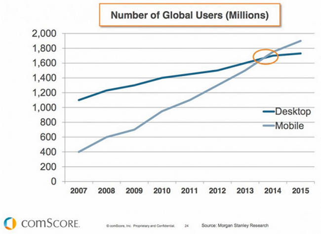
“Mobile to overtake fixed internet access by 2014” was a bold, yet equally anticipated, prediction from 2008 by Mary Meeker – of Kleiner Perkins Caulfield Byers – an analysts who specialises in reviewing and spotting potential trends in technology.
Well, we’re now past the tipping point as a report from comScore shows (below) and it’s no longer a case of asking whether or not mobile marketing is important, because with the advance in smartphone and tablet technology, we know that is.
It’s now a question of asking what needs to be done in order to ready your affiliate business and optimise your website for mobile visitors. Because as of 21 April 2015 Google will be changing its algorithm such that mobile search results will favour content that is optimised for mobile devices.
And let’s not forget about the growing demand from advertisers for mobile data/leads, providing affiliates with even more opportunities to increase revenue. So if you haven’t already got a mobile friendly website, or if you’re unsure, then here’s our recommendations on how to get it done.
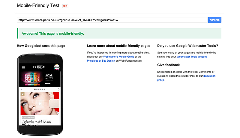
First you need to get all your facts straight. Use Google’s mobile friendly website checker to determine whether or not your website is properly configured and viewable on mobile devices. You can get there by clicking here.
If your site passes the test then you have nothing to worry about. We tested L’Oreal to see if their website was properly optimised and it was an absolute triumph (below).
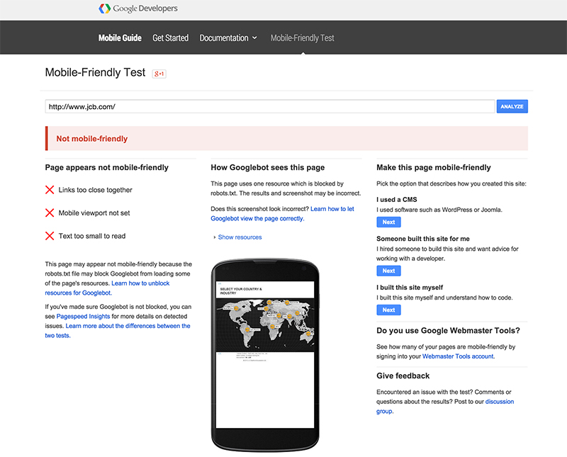
If it does not pass the test, however, the tool will provide recommendations for improvements specific to your website, giving you a clearer idea of how much work is needed to optimise it. We tested a different website and the checker showed us what was wrong and ways to it (below).
Chances are if you don’t already have a mobile friendly website then it probably won’t be mobile friendly in time for the 21 April algorithm. Don’t fret over this too much. Yes, it is very important you get it done but it’s more important that you get it done RIGHT.
Building a website, whether from scratch or upon an existing foundation, can be a mammoth task. Take this time to reassess ways in which you want to improve your website and make it better for all users, not just mobile. This could mean rethinking your entire website layout.
All in all, this could be a great opportunity for creating a better, more effective website, with a better all-round user experience. And remember, the 21 April update only affects mobile searches (searches performed on a mobile device) so your desktop traffic should not be at risk.
Your website has probably been receiving mobile traffic up until this point, regardless of whether it has been optimised or not, but more than likely bounces within a short time of arriving. This could be considerably improved, as well as increased, if you were to optimise your website to be mobile friendly.
Review your website analytics to see just how much mobile traffic your are receiving in comparison to how much actually converts. This will give you a better insight into how your website structure can be improved while optimising for mobile.
Most importantly, it will allow you to identify areas for potential mobile traffic you have yet to capture. Perform a keyword search to identify mobile search levels for areas of your affiliate business – whether that’s b2c or b3b – and take this into consideration during changes to your website layout, structure and use of text and imagery. This might also effect any paid traffic activities you currently/want to employ.

